Amazon Marketing Tiles: Dos & Don’ts for Driving Conversion
When it comes to selling on Amazon, strong copy only gets you halfway there. The other half? Visuals that stop the scroll. Amazon marketing tiles—the images that make up your product image carousel are often the deciding factor between a shopper clicking Add to Cart or bouncing to a competitor.
Done well, marketing tiles tell your brand’s story, highlight the product’s value, and give shoppers the confidence they need to purchase. Done poorly, they create friction, confusion, and lost sales.
This blog unpacks the dos and don’ts of Amazon marketing tiles, drawing on real-world best practices and Hinge Commerce’s expertise in building retail-ready content that converts.
Why Amazon Marketing Tiles Matter
Amazon is a visual-first marketplace. Shoppers skim before they read, and your marketing tiles provide the opportunity to instantly showcase why your product is worth buying.
Strong Amazon marketing tiles:
- Increase brand awareness by showcasing a strong, consistent brand identity across content.
- Improve conversion rates by highlighting product benefits and key differentiators.
- Reinforce brand trust with clear, compliant, and professional design.
- Boost purchase satisfaction by guiding shoppers through a clear, informative purchase journey.
- Enhance search visibility by supporting SEO and retail readiness through engaging, optimized content.
At Hinge Commerce, we’ve seen optimized tiles lift conversion rates, strengthen brand recall, and create consistency across SKUs. In other words, good tiles drive growth.
The Dos: What Amazon Marketing Tiles Should Include
✅ Use High-Quality, Clear Imagery
Grainy, cluttered, or poorly lit photos are an instant credibility killer. Use crisp, high-resolution images that remain clear on both desktop and mobile screens.
✅ Design for Mobile and Desktop
With more than half of Amazon’s traffic coming from mobile, mobile-friendly Amazon tiles are non-negotiable. Keep text minimal, legible, and centered so it doesn’t disappear on small screens.
✅ Show the Product in Use
Lifestyle photography is powerful. Don’t just show the item. Instead, show how it fits into a shopper’s life. From a snack mix at a picnic to a storage bin in a playroom, context builds emotional connection.
✅ Maintain Breathing Room
Negative space is your friend. Overcrowded tiles overwhelm shoppers and dilute key messages. Clean layouts with balanced spacing feel more professional and trustworthy.
✅ Focus on Purchase-Decision Info
Shoppers don’t want fluff; they want answers. Use your tile design to highlight what matters: ingredients, size, benefits, solutions, safety certifications, and more.
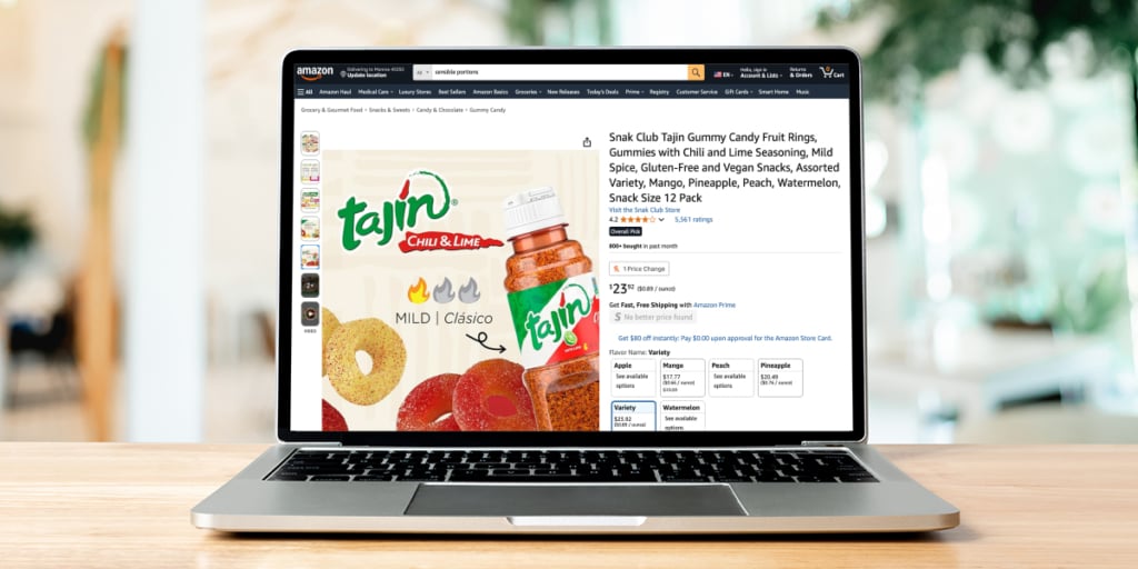
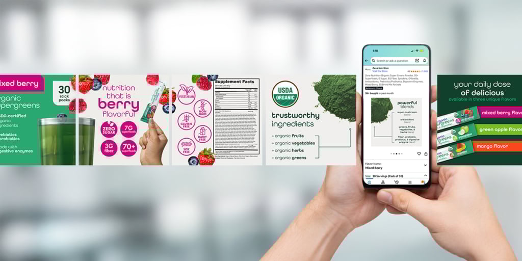
✅ Include Nutritional Information (Food & Grocery)
For consumables, include the nutrition label in the second image slot on most retail platforms. Shoppers expect it, and it helps demonstrate transparency and compliance while streamlining decision-making.
✅ Fill the Carousel
A half-complete carousel feels unfinished. Amazon tile best practices call for a full sequence: product features, benefits, details, lifestyle, and cross-sell opportunities.
✅ Tell a Visual Story
Each tile should play a role in guiding the shopper: from introduction → education → persuasion → cross-sell. Together, your carousel should feel like a cohesive brand narrative.
✅ Be Consistent Across SKUs
Consistency matters. Use the same brand fonts, colors, and tone across all products. A unified visual identity builds recognition and trust, especially in multi-product catalogs.
✅ Cross-Sell When Possible
Tiles are a prime space to showcase bundles, related SKUs, or “complete the set” messaging. Effective cross-sell content can increase basket size and average order value across retail platforms.
✅ Use AI to Support Design
Leverage AI tools to aid in competitive research, trend analysis, and creative inspiration. While AI can streamline early-stage exploration, final design decisions should stay with your team to ensure brand alignment and compliance.
The Don’ts: Amazon Marketing Tile Mistakes That Kill Conversions
❌ Don’t Use Low-Resolution Images
Shoppers won’t trust what they can’t see clearly. Blurry images look unprofessional and discourage purchase.
❌ Don’t Ignore Mobile Shoppers
If your text is too small or your imagery crops awkwardly on mobile, you’re losing sales. Mobile-friendly design is essential.
❌ Don’t Overcrowd with Text or Icons
Each tile should focus on one core message. Overstuffing makes the carousel harder to scan and dilutes impact.
❌ Don’t Mix Branding Styles
Switching fonts, colors, or design styles between products weakens brand equity. Consistency across all Amazon tiles is key.
❌ Don’t Skip Critical Details
Omitting essential information—like nutritional labels, ingredients, or product dimensions—leaves shoppers guessing. Across the digital shelf, hesitation can lead to lost sales and decreased trust.
❌ Don’t Use Generic Stock Imagery (If Possible)
Shoppers recognize staged, irrelevant photos instantly. Authenticity wins. Stick to real product photography and lifestyle shots if possible.
❌ Don’t Mis-Sequence the Carousel
A jumbled order (benefit → lifestyle → spec → hero) confuses shoppers. Instead, guide them logically from hero → features → proof → cross-sell.
❌ Don’t: Let AI Replace Human Oversight
AI can support efficiency, but it can’t ensure accuracy, brand consistency, or compliance. Always review AI-generated content to avoid off-brand, misleading, or non-compliant designs.
Example: A Winning Marketing Tile Carousel Flow
High-performing digital shelf tiles vary by category, product, and brand—but may include:
- Hero Tile: Brand-forward, product in real-life context
- Nutritional Info (if applicable): Transparent, compliant, easy to find
- Feature Callouts with Highlighted Info: Fast facts, size, flavor, USP
- Close-Up Detail: Showcase materials, textures, or packaging
- Lifestyle/Use-Case in Context: Reinforce how the product solves a problem
- Cross-Sell or Bundle Tile: Suggest add-ons or complementary products
This structure keeps shoppers engaged, answers their questions, and nudges them toward larger carts. View our creative portfolio for more examples.
Pro Tips for Next-Level Amazon Tile Design
- A/B Test Visuals: Test hero image variations or feature callouts to see what drives the best conversion lift.
- Localize Imagery: Tailor lifestyle shots to regional markets to resonate more deeply with shoppers.
- Leverage Icons Wisely: Simple, clean icons (“vegan,” “48-hour battery”) speed up scanning, without adding clutter.
- Apply Color Psychology: Use palette choices aligned with your branding and category (examples may include bold colors for kids, calm neutrals for beauty).
- Stay Compliant: Align every tile with Amazon’s creative and legal standards to avoid suppressions.
The Role of Amazon Marketing Tiles in Brand Success
Well-designed Amazon marketing tiles also serve as an extension of your brand’s storefront. Unlike plain product images, tiles give you a controlled space to reinforce brand voice, showcase differentiators, and educate shoppers visually. When executed with intention, tiles don’t just highlight features, they build trust and make your brand memorable across categories.
On the flip side, poor tile execution can do real damage. Overcrowded layouts, mismatched branding, or missing compliance elements not only frustrate shoppers but also put your listing at risk of suppression. Amazon is increasingly strict about creative standards, so following Amazon marketing tile best practices is about more than design. It’s about protecting visibility and sales.
Wrapping It Up: Retail-Ready Tiles = Retail-Ready Growth
Amazon marketing tiles aren’t just pretty pictures—they’re sales drivers. From imagery quality to carousel sequencing, every design choice impacts conversion.
Key Takeaways:
Do: Use high-quality imagery, optimize for mobile, show products in use, maintain branding consistency, highlight key points, and use tiles for cross-sells.
Don’t: Use blurry images, overcrowd designs, skip nutritional info, break branding consistency, or ignore mobile shoppers.
Hinge Commerce: Your eCommerce and Amazon Partner
At Hinge Commerce, we know that retail readiness lives in the details. Our creative team builds Amazon marketing tiles that don’t just check the box, but they elevate brands, increase conversions, and maximize ROI across marketplaces.
Don’t just sit on the digital shelf, stand out. In addition to Amazon design services, we offer:
- Creative Services for eCommerce Platforms
- Retail Media/Advertising
- Channel Management
- PIM Management (Registered Salsify Partner)
- Fulfillment Services
- Reimbursement Services
Contact us to set up a free consultation.